Dietary supplements are more popular than ever, but taking too many or the wrong combinations can...
Some features of our site, including online booking, are temporarily unavailable while we work on improving your care experience! Please call to schedule.
In 1992, the United States Department of Agriculture (USDA) introduced the Food Pyramid, a tool designed to be used by adults searching for what to include in a healthy diet. Since its introduction, the pyramid—which is now displayed as a plate instead of a pyramid—has undergone some drastic changes.
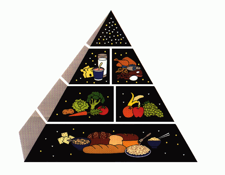
The USDA's initial pyramid diagram was divided into six separate horizontal sections, spread across three tiers. The bottom tier, which included grains such as bread and pasta, recommended that an individual eat 6-11 servings of these foods per day. The middle tier recommended adults eat 2-5 servings of fruits and vegetables and the top tier recommended adults eat 2-3 servings of dairy and protein.
But many people found the stacked tiers confusing and interpreted them as steps to advance through, rather than as individual pieces of a well-rounded diet. This led some people to eat only grains throughout the day, as that was the largest—and seemingly most important—tier on the pyramid.
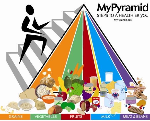
In 2005, the USDA introduced the MyPyramid system. In this new diagram, categories of food were displayed as vertical slices instead of horizontal tiers to clear up confusion.
"The MyPyramid diagram focused on illustrating three key concepts: variety, moderation and proportion," said Bradee Rojas, MS, RDN. "A variety of different colors made the diagram more appealing to children, and the accompanying illustration of a person climbing up the pyramid subconsciously planted the importance of exercise into their brains."
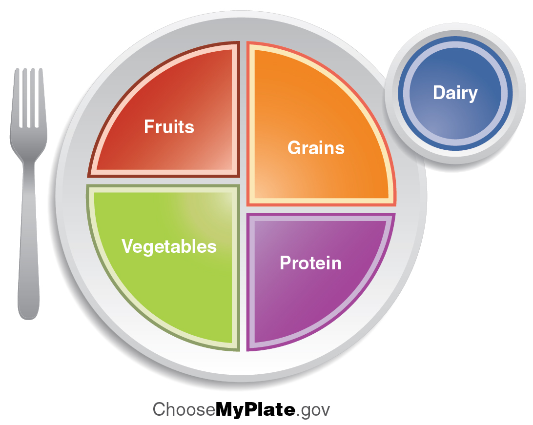
The “pyramid” used today, which was introduced in 2011, reflects the largest change in visual representation since the concept was first invented. In fact, the food pyramid is no longer a pyramid at all, and is instead represented as a plate.
The MyPlate campaign by the USDA uses an illustration of a plate separated into four key groups—fruits, vegetables, protein and grains. To the right of the plate is a small circle for dairy, meant to represent a glass of milk or cup of yogurt.
The MyPlate visualization works as a reminder to eat balanced portions from each of the 5 food groups: fruits, vegetables, grains, protein, and dairy. "Also, the USDA dropped the category for sugars and processed oils that they used to include, an indication that these types of foods really don't have a place in a healthy diet" said Rojas.
The MyPlate diagram is a visual example of what constitutes a healthy meal. Like most things in life, moderation—in both food choices and portions—is key to sustaining a healthy diet. Consider organizing your dinner plate to reflect that pictured in the MyPlate diagram. Start by filling up at least half of your plate with non-starchy vegetables, like broccoli or salad greens, and a piece of fruit; a quarter of your plate is left for lean protein and the remaining quarter of the plate for your starch or grain choice (like whole grain pasta or brown rice). You’ll likely find that by combining your intake of the different groups of food, you’ll feel fuller and healthier.
Inspira Health offers outpatient nutrition counseling in Bridgeton, Elmer, Vineland, and Woodbury to help you meet your individual nutritional needs and achieve your health goals! Call today to make an appointment: 1-800-INSPIRA.

Dietary supplements are more popular than ever, but taking too many or the wrong combinations can...

Ultra-processed foods are everywhere, but eating them often can crowd out more nutritious choices...

Instant ramen has become a popular go-to meal, but improper preparation can lead to burns, excessive...